PAPERBOY RESTAURANT
Design Concept
Paperboy is an Austin-based food truck that is growing in popularity and has great potential for improvement in their brand. In order to ensure a steady business growth, I’m going to rebrand the restaurant in order to attract more visitors and locals.

Objective
Our main goal is to rebrand the business as a new restaurant that stands out to a wider audience and achieves higher sales.
Target Audience
This is a family-friendly place that mostly caters to Austin locals, but also residents of neighboring towns and cities in Texas who wish to sample the cuisine.
My Duty
Rebranding, Merchandise, Logo Design, Illustration
The Business
Originally, this business was just a small food truck with tasty food that had potential to expand. Because of this, I decided to redesign their brand, beginning with a new logo. Although the company had a good name, it lacked a creative appearance. In addition to this, the company had no design for its products or menu, for these reasons, the company was in need of a new look


Inspiration
The primary inspiration came from other restaurants that had a bright and colorful ambiance. To represent the clean and contemporary appearance of the business, I utilized the original colors of the company, white and blue.
Logo Design
I designed the logo primarily drawing paper cutouts of people to represent family, friends, and a community. As for the fork and knife, they represent the restaurant and food. The typeface has rounded characteristics, making the business appear friendly and inviting. Combining these ideas to develop a fun, simple, and memorable logo for the business.

FINAL LOGO DESIGN


PATTERNS
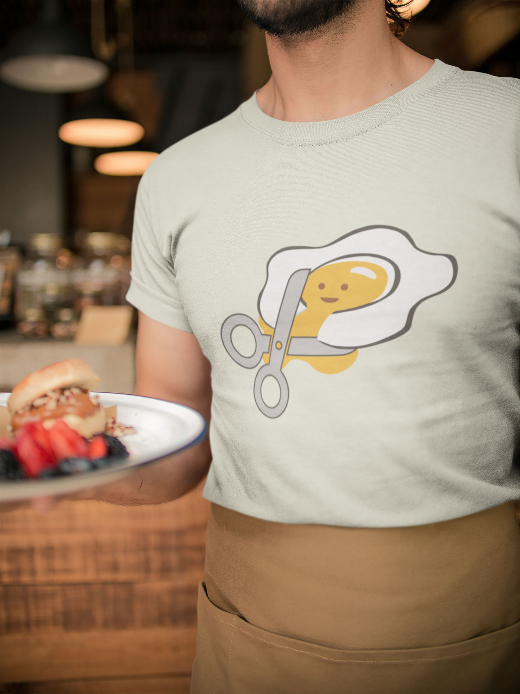
I wanted to imply that different types of foods represent different eating hours, such as eggs representing breakfast, avocados representing organic food, and sandwiches representing lunch.


